3. sentieri.co

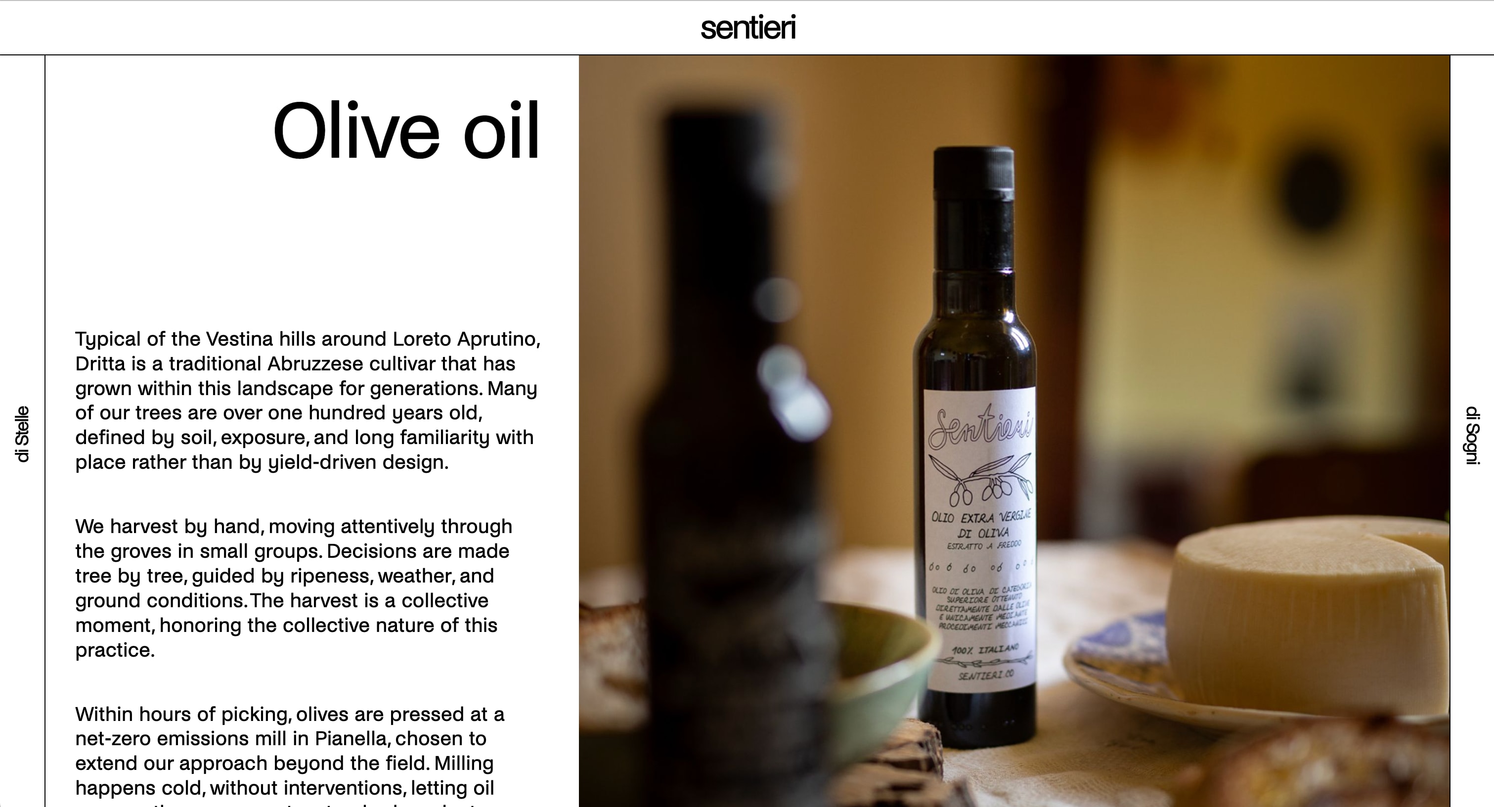
The Olive Oil page of sentieri.co on a laptop. A white page with a thin black header carrying the word sentieri. At the far left a narrow vertical bar reads di Stelle, at the far right one reads di Sogni. Between them, a text pane with the large title Olive oil and three paragraphs about the Dritta olive, the harvest by hand and the mill, and a wider pane filled by a photograph of a bottle of Sentieri extra virgin olive oil on a table beside a round cheese.

sentieri.co is the website of Sentieri, in the town of Loreto Aprutino in Abruzzo, Italy. Sentieri is two things run by the same people: Sentieri di Stelle, a vineyard and olive grove that makes natural wine and olive oil, and Sentieri di Sogni, a cultural collective that runs artist residencies and events. The website presents both halves in one place, and I designed it together with Marius Houschyar and Isabel Meldner and developed it myself.

In September 2025 the couple who run Sentieri asked me for a website and content management system. They wanted the site to feel modern, rustic, experimental and editorial, and they did not want it to look like a template. Since they are not technical, they also needed to be able to change the content themselves after the handover, without asking me, hence the CMS integration into their custom website.

Visitors read about the wine, the olive oil, the residencies and the archive, on a laptop or on a phone, at sentieri.co. The owners write and change the pages themselves in an editing tool called Sanity Studio, and a change they publish reaches the live site within a minute. I still look after the code, since the website project is still a work in progress.
For
Sentieri di Stelle and Sentieri di Sogni, Loreto Aprutino, Abruzzo, Italy
Role
Front-end developer. Concept and design in collaboration with Marius Houschyar and Isabel Meldner
Built with
Next.js 16, React 19, TypeScript, Tailwind CSS 4, Sanity
Runs on
Vercel, at sentieri.co
Dates
September 2025 to present
The owners edit a page in the Studio as one array of blocks, and the same array becomes two panes on a laptop and one column on a phone.

3.1 Two panes, two sidebars

Since Sentieri is two things, the site had to show both of them without one hiding the other. On a laptop each half has its own sidebar, a narrow vertical bar at the edge of the screen, with di Stelle on the left and di Sogni on the right. A click on a sidebar slides it across the page and opens the menu for that half: Wine, Olive Oil and Shop under di Stelle, and Residencies, Archive and About us under di Sogni.

Between the two sidebars the page is split into two panes that scroll separately, a narrow one for the text and a wider one for the images, so the photographs stay in view while the text is read.

The pages of di Stelle have their text on the left, and the pages of di Sogni are mirrored, with the text on the right. In this way a visitor can tell which half of Sentieri they are in without reading a word.

A sidebar is a menu

A click slides the sidebar across the page, and its menu fills the space it crossed.

Mirrored

Both halves use the same page layout, mirrored. The text is on the left under di Stelle and on the right under di Sogni.

The di Stelle menu

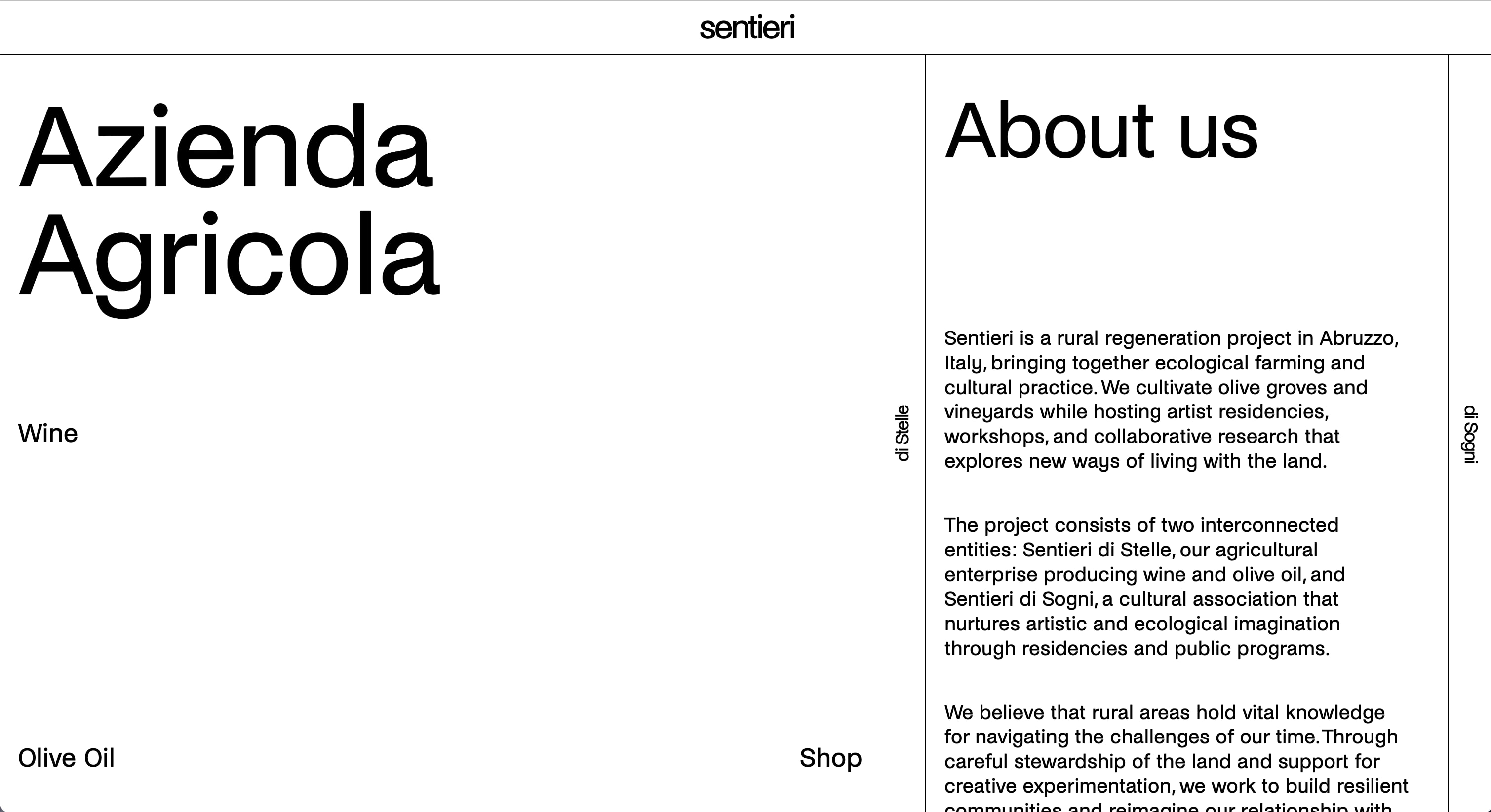
The About us page with the di Stelle menu open. The left part of the page is white with the words Azienda Agricola in very large type, the link Wine at mid height, and Olive Oil and Shop at the bottom corners. The di Stelle bar now stands to the right of the menu, and beyond it the About us page is still visible, with its title and its first paragraphs about Sentieri.
The left sidebar after a click: it has slid across the page and its menu fills the space it crossed.

A di Sogni page

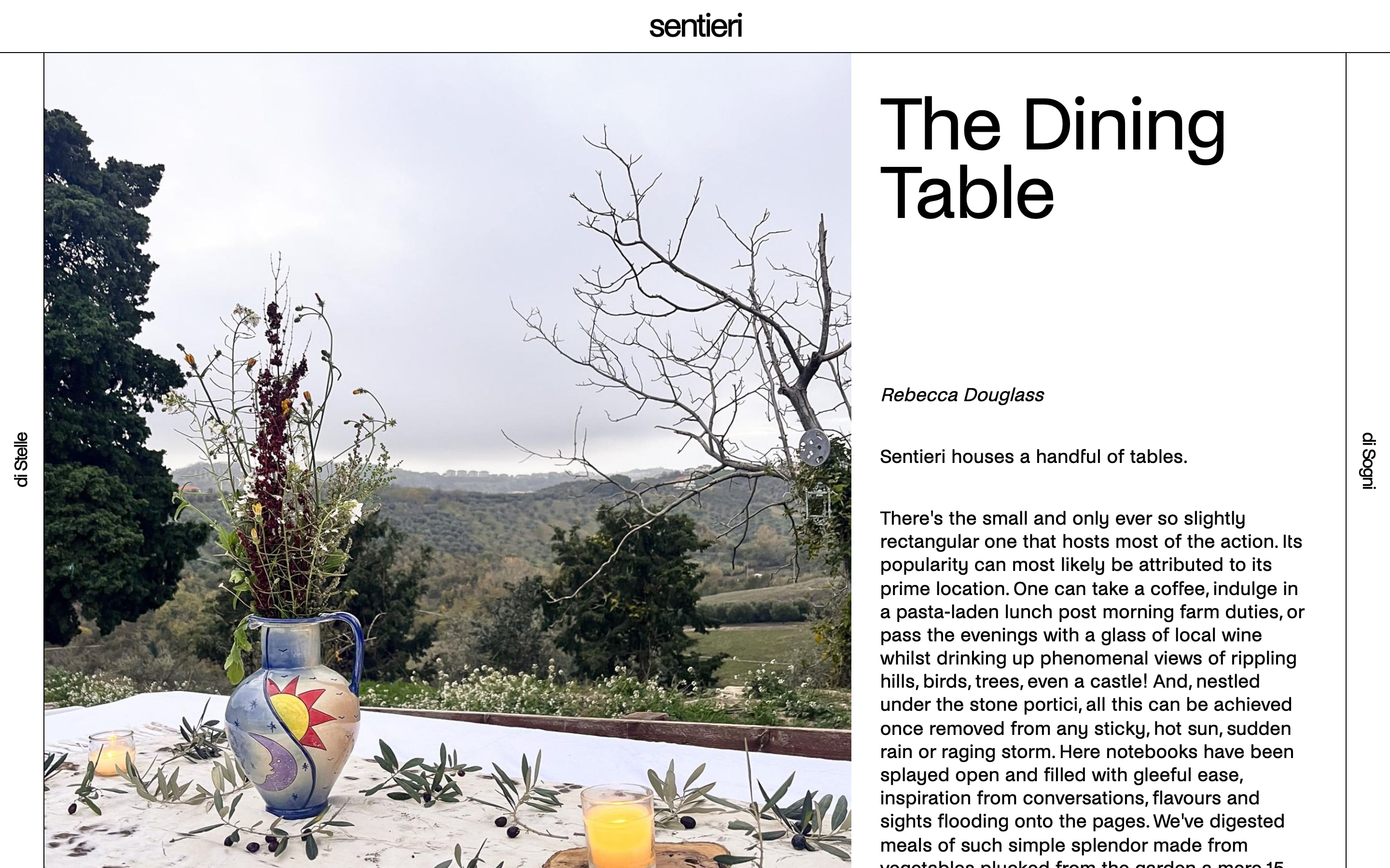
An article page of sentieri.co titled The Dining Table. The photograph is on the left: a painted jug of wild flowers and a glass of juice on a white cloth scattered with olives, hills behind. The text pane is on the right, with the title in large type, the author's name in italics and the opening paragraphs.
An article from the archive, on the di Sogni side. It is the same page layout as the Wine page, mirrored.

3.2 From colour to black and white

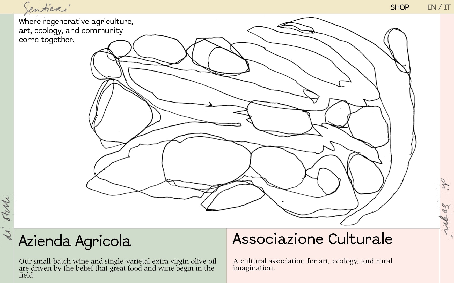
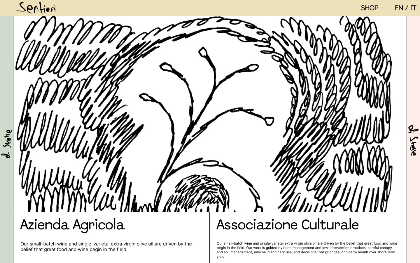
I designed the site together with Marius Houschyar and Isabel Meldner. The first templates, in November 2025, were in colour: a cream header, a green sidebar for di Stelle and a pink one for di Sogni, a handwritten logo, and line drawings where a photograph would usually go. The first build of the site, in December 2025, kept those colours and used two typefaces, Abordage for the titles and Meridien for the text.

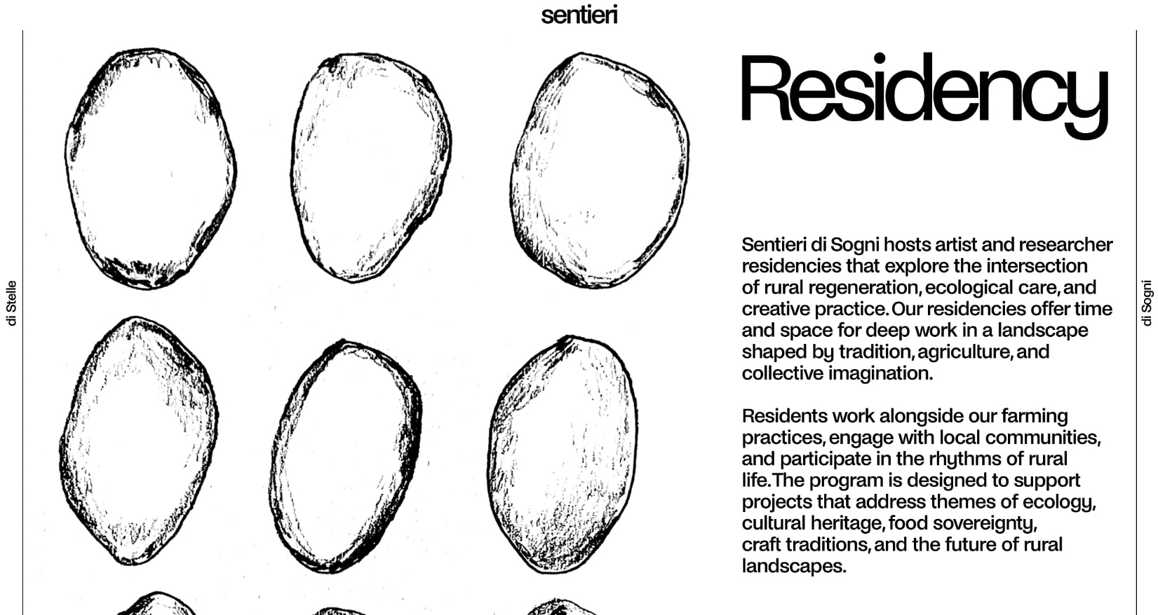
In February 2026 the colour was taken out. Every background became white and every line and letter black, and by March a single typeface, Noi Grotesk, was used for everything from the page titles to the captions, with Geist Mono as the one exception, for subheaders and short taglines. The only colour left on the site now comes from the photographs and the drawings.

What stayed the same through every draft was the structure: the header, the two sidebars and the page split in two. The three drafts below show how the look changed around it.

November 2025

A design template for the landing page. A cream header with a handwritten Sentieri logo, a pale green bar at the left and a pale pink one at the right. A large continuous line drawing of rounded shapes fills the page, with the line Where regenerative agriculture, art, ecology, and community come together. Below it, a green box titled Azienda Agricola and a pink box titled Associazione Culturale.
A template for the landing page from the first round, in cream, green and pink, with a handwritten logo and a line drawing.

December 2025

The second draft of the landing page. The same cream header and coloured side bars, and a bold black brush drawing of a plant with looping strokes filling the page. Below it two white boxes titled Azienda Agricola and Associazione Culturale, each with a line of text.
The second draft of the same page, with a heavier drawing and the two halves of Sentieri as boxes under it.

March 2026

The third draft of the Residency page, in black and white. The left pane holds ink drawings of nine olives in three rows. The right pane has the title Residency in very large grotesque type and two paragraphs about the residencies. Thin black lines mark the header and the two side bars, di Stelle and di Sogni.
The third draft of the Residency page, in black and white with one typeface, and with the drawings given a whole pane.

3.3 One array, desktop and phone

On a phone there is only room for one column, so the two panes cannot sit side by side. A common solution is to describe every page twice, once for each layout, but then every change has to be made in two places.

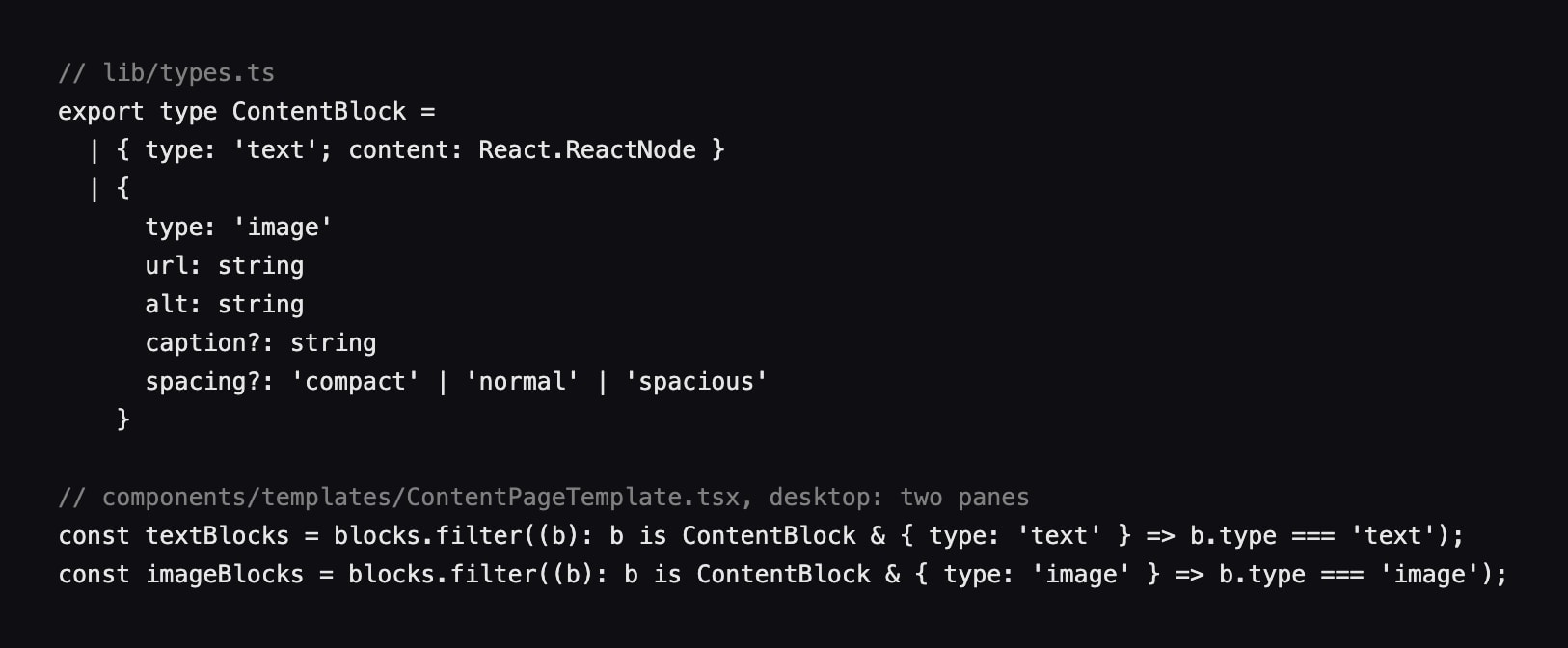
Instead, every page on the site is built from a single array, an ordered list of content blocks, where each block is either a piece of text or an image. On a laptop the text blocks go to the text pane and the image blocks to the image pane. On a phone the same array is simply read from top to bottom. The owners therefore only have to put a page in order once, and it works on both.

On a phone the two sidebars become one bar under the header, with di Stelle on the left half and di Sogni on the right, and each half opens the same menu as its sidebar.

Desktop

On a laptop the array is split in two, with the text blocks in one pane and the image blocks in the other.

Phone

On a phone the same array is read from top to bottom.

The block

TypeScript on a dark ground. From lib/types.ts: the type ContentBlock, which is either type text with content, or type image with a url, an alt text, an optional caption and an optional spacing of compact, normal or spacious. From ContentPageTemplate.tsx: const textBlocks, the blocks filtered to type text, and const imageBlocks, the blocks filtered to type image.
The code behind it. A block is either text or an image, and on a laptop two lines split the array into the two panes. On a phone the array is used as it is.

An article

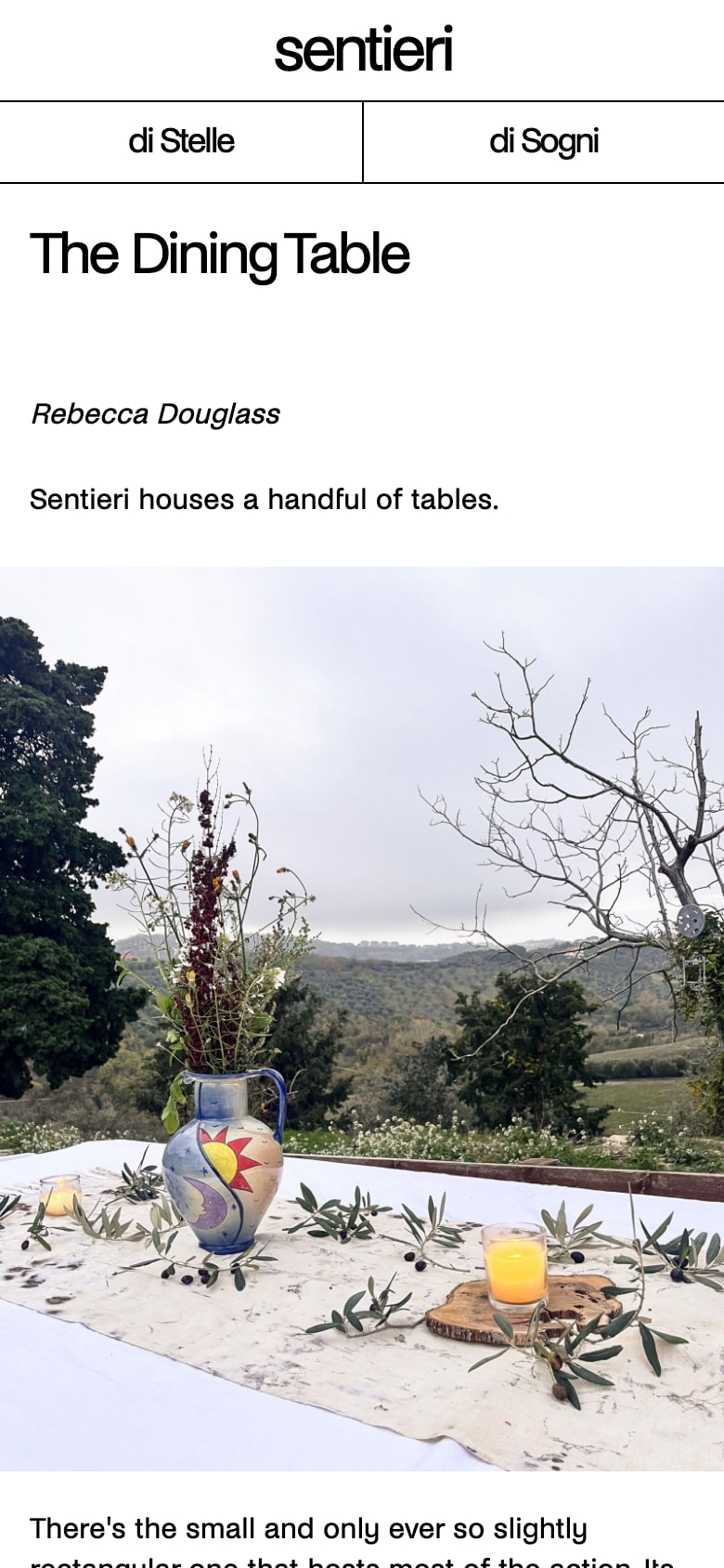
The Dining Table article at phone width. The sentieri header, a bar split into di Stelle and di Sogni, the title, the author's name, a first line of text, the photograph of the jug of flowers at full width, and the text continuing below it.
The same article on a phone, with the blocks in the order the owners gave them.

The menu

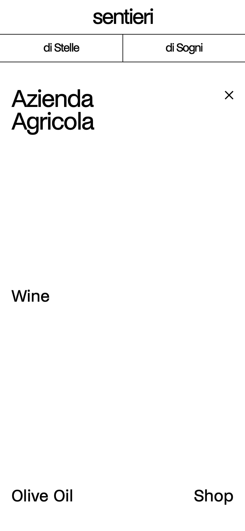
The di Stelle menu at phone width. Under the header and the split bar, a white screen with Azienda Agricola in large type and a close mark at the top right, the link Wine at mid height, and Olive Oil and Shop at the bottom corners.
The di Stelle half of the bar on a phone, opened.

The landing page

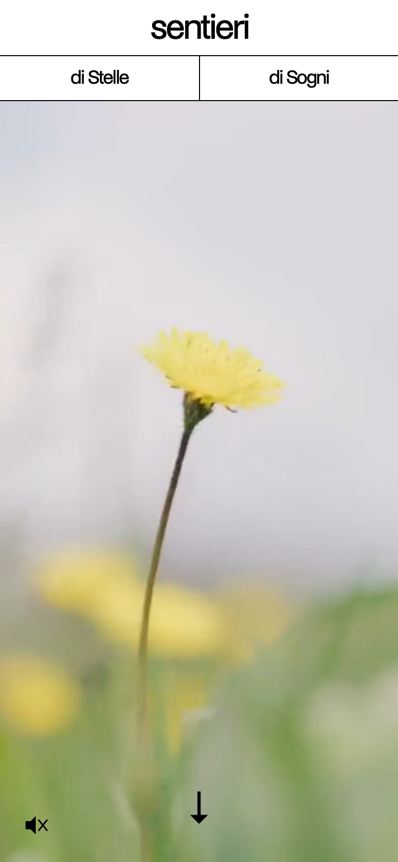
The landing page at phone width. Under the header and the split bar, a full height frame of video: a yellow wild flower in soft focus against a pale sky and green grass. A muted speaker icon at the bottom left and a down arrow at the bottom centre.
On a phone the landing page opens on a looping video from the farm, with the sound off until the visitor turns it on.

3.4 The owners edit it themselves

The people who run Sentieri are not technical, and after the handover they would be the ones changing the site, without asking me. So the editing tool had to be simple enough for them to use, and safe enough that they could not break anything.

They edit in the Studio, an editing tool from Sanity that is built into the site itself. The blocks of a page appear there as one list, and a page is put in a new order by dragging its blocks up and down. When they publish a change, it reaches the live site within a minute, with nothing for me to do.

Each of the main pages, such as the Wine page, exists only once. An editor can change what is on it, but cannot delete it or make a second copy of it by mistake.

The site already had pages before the Studio was added, so they had to keep working while their content was moved into it. The six articles of the archive were moved first, and then the Wine and Olive Oil pages.

Live in a minute

A change published in the Studio reaches the live site within a minute.

One of each

The Wine page exists only once. An editor can change it, but cannot delete it or make a second one.

The Studio

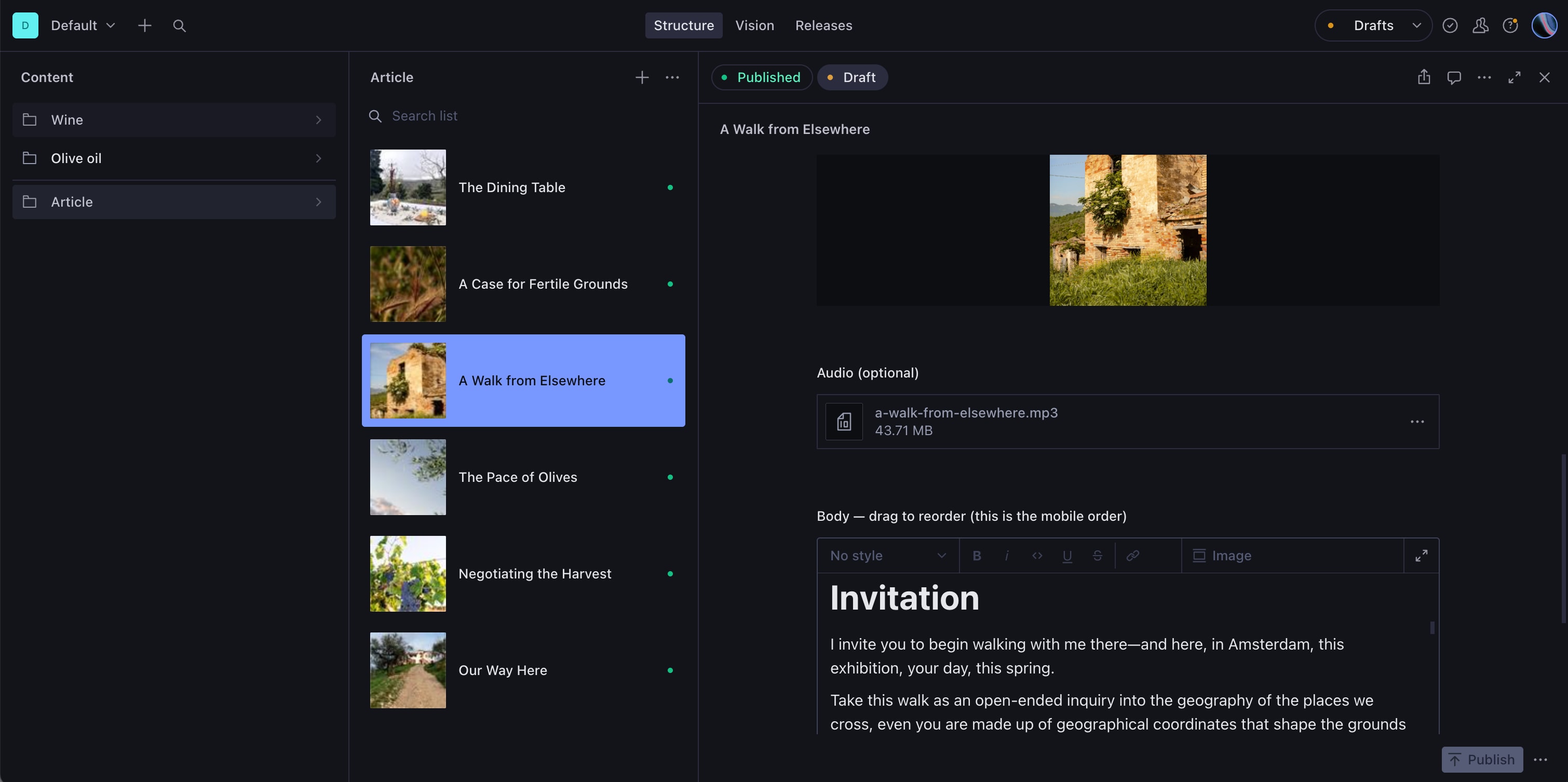
Sanity Studio in its dark theme. At the left a list of content: Wine, Olive oil and Article. In the middle the six articles, each with a thumbnail: The Dining Table, A Case for Fertile Grounds, A Walk from Elsewhere, which is selected, The Pace of Olives, Negotiating the Harvest and Our Way Here. At the right the article A Walk from Elsewhere: a photograph of a stone ruin, an optional audio file, and the body under the note drag to reorder, this is the mobile order, opening on the heading Invitation.
An article from the archive in the Studio. The articles are listed in the middle, and on the right the article’s image, its sound file and its text, whose blocks are dragged to change their order.

3.5 Credits

Design: Oscar Ström, Marius Houschyar and Isabel Meldner. Programming: Oscar Ström.

Client: Sentieri di Stelle and Sentieri di Sogni, Loreto Aprutino, Abruzzo. Paid client work, from September 2025 and ongoing.

The screenshots were taken from the live site on 17 and 23 September 2026. The photographs, drawings and articles in them belong to Sentieri and their authors.